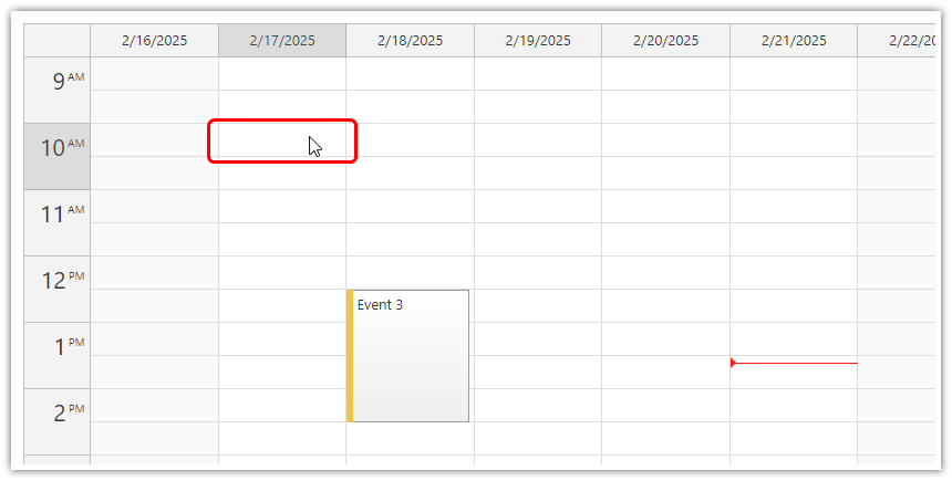
The default duration of the time cells in the Calendar component is 30 minutes.
You can customize the cell duration using cellDuration property (in minutes).
The minimum value is 1 (minute).
The maximum value is 60 (1 hour) in the Lite version. In the Pro version, the maximum value is not limited.
When changing the time cell duration, you may also want to adjust the cell height (in pixels).
Pro Version
The Pro version supports setting the cell duration using one of the predefined scale values (hour, day, week …). The cellDuration value will only be applied if the scale property is set to "CellDuration".
The time header displayed on the left side of the calendar uses 1-hour slots. You can use define custom time header cell duration using the timeHeaderCellDuration property.
You can also switch the scale and cell height quickly by defining custom zoom levels.
JavaScript Calendar
In the JavaScript Calendar component, set the value of cellDuration property to the desired number of minutes:
<div id="calendar"></div>

<script>
  const calendar = new DayPilot.Calendar("calendar", {
    cellDuration: 15,
    // ...
  });
  calendar.init();
</script>
Angular Calendar
The following Angular Calendar example sets the calendar slot size to 15 minutes:
import {Component, ViewChild, AfterViewInit} from "@angular/core";
import {DayPilot, DayPilotCalendarComponent} from "daypilot-pro-angular";

@Component({
  selector: 'calendar-component',
  template: `<daypilot-calendar [config]="config" [events]="events" #calendar></daypilot-calendar>`,
  styles: [``]
})
export class CalendarComponent implements AfterViewInit {

  @ViewChild("calendar")
  calendar!: DayPilotCalendarComponent;

  events: any[] = [];

  config: DayPilot.CalendarConfig = {
    viewType: "Week",
    cellDuration: 15,
    // ...
  };

}
React Calendar
In the React Calendar component, use the cellDuration attribute of the <DayPilotCalendar> tag:
import React, {Component} from 'react';
import {DayPilot, DayPilotCalendar} from "daypilot-pro-react";

class Calendar extends Component {

  constructor(props) {
    super(props);
    this.state = {
      // ...
    };
  }

  render() {
    return (
      <div>
        <DayPilotCalendar
          viewType={"Week"}
          cellDuration={15}
        />
      </div>
    );
  }
}

export default Calendar;
Vue Calendar
The Vue Calendar component defines the properties using the :config attribute:
<template>
  <DayPilotCalendar id="dp" :config="config" ref="calendar" />
</template>

<script>
import {DayPilot, DayPilotCalendar} from 'daypilot-pro-vue'

export default {
  name: 'Calendar',
  data: function() {
    return {
      config: {
        viewType: "Week",
        cellDuration: 15,
        // ...
      },
    }
  },
  components: {
    DayPilotCalendar
  },
}
</script>
ASP.NET WebForms
<DayPilot:DayPilotCalendar runat="server" ID="DayPilotCalendar1"
  CellDuration="15"
  ...
/>
ASP.NET MVC
MVC View
@Html.DayPilotCalendar("dpc", new DayPilotCalendarConfig {

  // ...
  CellDuration = 15,
  // ...

})
Availability
Availability of this feature in DayPilot editions:
| Lite | Pro | |
|---|---|---|
| DayPilot for JavaScript | ||
| DayPilot for ASP.NET WebForms | ||
| DayPilot for ASP.NET MVC | ||
| DayPilot for Java |
 DayPilot