 DayPilot
DayPilot Angular Calendar is an interactive calendar component for appointment booking, room and equipment reservations, staff schedules, and timetables. Time runs vertically, with days or resources displayed as columns. You can start with a day or week view and add date navigation, drag-and-drop editing, and the event details your application needs.
The component is available in DayPilot Lite, the open-source edition under the Apache License 2.0, and DayPilot Pro, the commercial edition with additional scheduling features. Both provide Angular components, TypeScript definitions, and bindings for configuration and event data.
Try the Angular calendar demo · Get the starter project · Configure a calendar in UI Builder
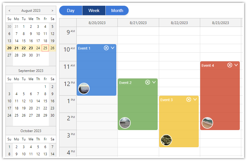
Angular Calendar Features
The day and week layouts work well when users need to see the timing and duration of appointments. A resource calendar uses the same vertical time axis to compare bookings for several people, rooms, or machines side by side.
DayPilot Lite and Pro
Day, work-week, week, and custom day views. Choose the calendar view and number of days to display. Combine Calendar with the Angular monthly calendar when your application needs a month overview as well.
Resources as columns. Display a daily schedule for staff, rooms, or equipment using the resource calendar. Each event belongs to a resource column, and users can move it to a different resource.
Interactive event editing. Let users select a time range to create an event, then move or resize it using drag and drop. Handle these actions in Angular callbacks to open an editor, update your application state, and save changes to your backend.
Event appearance and CSS themes. Use colors, labels, and event actions to make different types of appointments easy to recognize. Event customization, cell customization, and CSS themes let you adapt the calendar to your application.
Working hours and date formatting. Set business hours, time-slot duration, and the first day of the week. Use a locale to format dates and times for your users.
Date navigation and Angular state. Connect an Angular date picker, add previous/next buttons, and load events for the selected period. Bind options and event data using signals or ordinary objects and arrays.
Additional DayPilot Pro Features
Grouped resource headers. Organize rooms by location, staff by team, or resources under individual days with a column hierarchy. Try the grouped-column demo.
Wide resource schedules. Keep columns readable at a fixed width and use horizontal scrolling to reach additional resources. Try the 50-column demo.
Overnight schedules. Display a working day that crosses midnight, such as a night shift or television schedule. See overnight scheduling and the live demo.
All-day events and touch interaction. Display all-day events above the time grid and support scheduling gestures on touch devices.
Export. Export the calendar as an image, use the image in a PDF document, or create an Excel spreadsheet. The export guides describe the required libraries and format-specific limits. Try the Excel export demo.
The Pro demos above show the underlying JavaScript Calendar features that you can configure through the Angular component. For the complete edition comparison, see the feature matrix. If you need time to run horizontally with resources as rows, see the Angular Scheduler.
Angular Calendar Demos and Tutorials
Explore the live examples before adding the component to your application. Each tutorial explains the implementation and provides a downloadable Angular project. The edition is shown for each example so you can start with the package you plan to use.
Calendar Views and Date Navigation
Angular Calendar with Day/Week/Month Views — Live demo (Lite)
A starting point for an application with day, week, and month buttons and a date picker. It combines Calendar, Month, and Navigator components, with a shared event source across the views.Angular Resource Calendar — Live demo (Lite)
Schedule events for resources displayed as columns. See resource columns, event actions, and custom column headers in a vertical daily schedule.Angular Calendar: Date Switching — Live demo (Lite)
Connect a date picker to the calendar and add previous/next navigation. This is a focused example of keeping the selected date and displayed week together.Angular Date Picker with Drag-and-Drop Range Selection — Live demo (Lite)
Let users select a custom date range in the Navigator and display that range in the Calendar, instead of always showing a fixed week.
Editing, Appearance, and Layout
Angular Calendar with Undo/Redo — Live demo (Lite)
Add an application-managed history for event creation, movement, resizing, and deletion. The tutorial shows how to build undo/redo controls around Calendar callbacks.Angular Calendar: CSS Themes — Live demo (Lite)
Compare calendar themes and switch them at runtime. Use this example to explore styling without changing the scheduling data or Angular bindings.Angular Calendar: Event Filtering — Live demo (Pro)
Combine text and event-type filters to choose the events displayed in the calendar. See how the Calendar filtering API works with Angular state.Angular Calendar: Full Screen Layout — Live demo (Pro)
Make the calendar fill the available application window, with a collapsible date-picker sidebar. Useful when the schedule is the main working area of the application.Angular Calendar: Detect Orientation Change — Live demo (Pro)
Change the calendar layout when the screen switches between portrait and landscape. Explore how an Angular application can adapt the visible schedule to its available space.
Backend Integration and Specialized Schedules
Angular Appointment Calendar with PHP/MySQL (Lite)
A complete example of loading appointments and saving changes through a REST API. Its Angular scaffolding predates the standalone setup below; use it for the backend workflow and adapt the project setup to your application.Angular Timetable (Pro)
Build a weekly timetable with custom time blocks and labels. The tutorial uses an older Angular project structure but illustrates a specialized Calendar layout.Angular Calendar: Displaying a Custom Set of Days (Pro)
Display a selected set of dates as columns, including non-consecutive dates. This example uses an older Angular project structure; the column configuration is the main pattern to reuse.
Configure an Angular Calendar Visually

Calendar UI Builder lets you change the calendar's appearance and behavior while seeing the result immediately. Select an Angular target and the edition you want to use, then download a starter project with your configuration. You can continue editing the options in TypeScript after downloading the project.
Installation
DayPilot Lite
Install @daypilot/daypilot-lite-angular from npm:
npm install @daypilot/daypilot-lite-angularDayPilot Pro
At npm.daypilot.org, select Angular and copy the installation command for daypilot-pro-angular. Licensed customers can obtain their package URL in the customer area.
The examples use standalone Angular components. Import DayPilotModule in the component that contains the DayPilot tag.
Display a Weekly Appointment Calendar
Start with a Monday-first week and one two-hour meeting.
calendar.component.ts
import {Component} from '@angular/core';
import {DayPilot, DayPilotModule} from '@daypilot/daypilot-lite-angular';

@Component({
  selector: 'app-calendar',
  standalone: true,
  imports: [DayPilotModule],
  template: `
    <daypilot-calendar
      [config]="config"
      [events]="events"></daypilot-calendar>
  `
})
export class CalendarComponent {
  config: DayPilot.CalendarConfig = {
    startDate: '2026-10-05',
    viewType: 'Week',
    weekStarts: 1
  };

  events: DayPilot.EventData[] = [
    {id: 'meeting', text: 'Meeting',
      start: '2026-10-05T10:00:00', end: '2026-10-05T12:00:00'}
  ];
}
viewType: "Week" displays a week containing startDate. weekStarts: 1 makes Monday the first column. Events use a unique id, display text, and start/end date-times. The meeting ends at 12:00; event ends are exclusive.
Import CalendarComponent in the parent component and use <app-calendar></app-calendar> in its template.
The examples use Lite. For Pro, change the package import to daypilot-pro-angular.
See event loading for data formats and loading options.
Navigate and Load Appointments
Previous and Next move by one week. Request appointments for that week, then replace the bound event array with the JSON array returned by your backend.
calendar-loading.component.ts
import {Component, ChangeDetectorRef, inject, OnInit} from '@angular/core';
import {DayPilot, DayPilotModule} from '@daypilot/daypilot-lite-angular';

@Component({
  selector: 'app-calendar',
  standalone: true,
  imports: [DayPilotModule],
  template: `
    <button (click)="navigate(-1)">Previous week</button>
    <button (click)="navigate(1)">Next week</button>
    <daypilot-calendar
      [config]="config"
      [events]="events"></daypilot-calendar>
  `
})
export class CalendarComponent implements OnInit {
  config: DayPilot.CalendarConfig = {
    startDate: '2026-10-05',
    viewType: 'Week',
    weekStarts: 1
  };

  events: DayPilot.EventData[] = [];

  private changes = inject(ChangeDetectorRef);

  private loadRequest = 0;

  ngOnInit() {
    this.loadData();
  }

  navigate(offset: number) {
    const start = new DayPilot.Date(this.config.startDate!).addDays(offset * 7);
    this.config = {...this.config, startDate: start};
    this.loadData();
  }

  async loadData() {
    const request = ++this.loadRequest;
    const start = new DayPilot.Date(this.config.startDate!);
    const end = start.addDays(7);
    const url = `/api/events?start=${start}&end=${end}`;
    try {
      const {data} = await DayPilot.Http.get(url);
      if (request !== this.loadRequest) { return; }
      this.events = data;
      this.changes.markForCheck();
    } catch {
      if (request === this.loadRequest) {
        await DayPilot.Modal.alert('Could not load data.');
      }
    }
  }
}
The /api/events URL represents your own backend. Return items that overlap the requested range: item start is before the requested end, and item end is after the requested start. Failed requests display a DayPilot dialog.
The request counter prevents an older response from replacing data after another navigation action.
Create Appointments by Selecting Time
This complete variation of the first example handles time range selection. The selection supplies the dates; the dialog supplies the name.
calendar-creation.component.ts
import {Component} from '@angular/core';
import {DayPilot, DayPilotModule} from '@daypilot/daypilot-lite-angular';

@Component({
  selector: 'app-calendar',
  standalone: true,
  imports: [DayPilotModule],
  template: `
    <daypilot-calendar
      [config]="config"
      [events]="events"></daypilot-calendar>
  `
})
export class CalendarComponent {
  config: DayPilot.CalendarConfig = {
    startDate: '2026-10-05',
    viewType: 'Week',
    weekStarts: 1,
    onTimeRangeSelected: async args => {
      const modal = await DayPilot.Modal.prompt('Appointment name:', 'New appointment');
      args.control.clearSelection();
      if (modal.canceled) { return; }
      args.control.events.add({
        id: DayPilot.guid(), text: modal.result,
        start: args.start, end: args.end
      });
    }
  };

  events: DayPilot.EventData[] = [
    {id: 'meeting', text: 'Meeting',
      start: '2026-10-05T10:00:00', end: '2026-10-05T12:00:00'}
  ];
}
Canceling the dialog leaves the data unchanged. events.add() inserts the new event locally. In an application with a backend, create the record with a POST request and use the returned ID before adding it to the view.
Move, Resize and Save Events
Moving changes the event position; resizing changes its duration. Both work in the first example without extra configuration. The component updates the display and the supplied data object automatically.
Use the callbacks after the edit to persist the result. This example sends the changed record to the backend; it does not reload the collection after each drag.
calendar-saving.component.ts
import {Component} from '@angular/core';
import {DayPilot, DayPilotModule} from '@daypilot/daypilot-lite-angular';

@Component({
  selector: 'app-calendar',
  standalone: true,
  imports: [DayPilotModule],
  template: `
    <daypilot-calendar
      [config]="config"
      [events]="events"></daypilot-calendar>
  `
})
export class CalendarComponent {
  config: DayPilot.CalendarConfig = {
    startDate: '2026-10-05',
    viewType: 'Week',
    weekStarts: 1,
    onEventMoved: args => this.saveEvent(args.e.data),
    onEventResized: args => this.saveEvent(args.e.data)
  };

  events: DayPilot.EventData[] = [
    {id: 'meeting', text: 'Meeting',
      start: '2026-10-05T10:00:00', end: '2026-10-05T12:00:00'}
  ];

  async saveEvent(data: DayPilot.EventData) {
    try {
      await DayPilot.Http.put(`/api/events/${data.id}`, data);
    } catch {
      await DayPilot.Modal.alert('The change could not be saved.');
    }
  }
}
The /api/events/{id} endpoint accepts the updated JSON record. A failed save is reported while the local edit remains visible; add retry or rollback behavior to suit your application. To disable an interaction, set eventMoveHandling or eventResizeHandling to "Disabled".
Handle a Event Click
To display the clicked item’s name, add this callback to config:
onEventClick: args => DayPilot.Modal.alert(DayPilot.Util.escapeHtml(args.e.text()))DayPilot.Modal.alert() accepts HTML. escapeHtml() displays the item’s name as plain text.
Access the Calendar API
Use the event collection API to find and rename the meeting. The wrapper reference, button and handler are shown together.
calendar-api.component.ts
import {Component, ViewChild} from '@angular/core';
import {
  DayPilot, DayPilotModule, DayPilotCalendarComponent
} from '@daypilot/daypilot-lite-angular';

@Component({
  selector: 'app-calendar',
  standalone: true,
  imports: [DayPilotModule],
  template: `
    <button (click)="renameEvent()">Rename meeting</button>
    <daypilot-calendar
      #calendar
      [config]="config"
      [events]="events"></daypilot-calendar>
  `
})
export class CalendarComponent {
  @ViewChild('calendar') calendar!: DayPilotCalendarComponent;

  config: DayPilot.CalendarConfig = {
    startDate: '2026-10-05',
    viewType: 'Week',
    weekStarts: 1
  };

  events: DayPilot.EventData[] = [
    {id: 'meeting', text: 'Meeting',
      start: '2026-10-05T10:00:00', end: '2026-10-05T12:00:00'}
  ];

  async renameEvent() {
    const control = this.calendar.control;
    const event = control.events.find('meeting');
    const modal = await DayPilot.Modal.prompt('Event name:', event.text());
    if (modal.canceled) { return; }
    event.text(modal.result);
    control.events.update(event);
  }
}
@ViewChild provides the wrapper; its control property exposes the underlying JavaScript component after initialization. The wrapper creates and disposes it. See the DayPilot.Calendar API for methods, properties and callbacks.
Load Data into Signal Inputs
If your application stores the collection in an Angular signal, pass that signal to the same input. This standalone variation loads data and calls set(); the wrapper observes the new collection.
calendar-signal-loading.component.ts
import {Component, OnInit, signal} from '@angular/core';
import {DayPilot, DayPilotModule} from '@daypilot/daypilot-lite-angular';

@Component({
  selector: 'app-calendar',
  standalone: true,
  imports: [DayPilotModule],
  template: `
    <button (click)="navigate(-1)">Previous week</button>
    <button (click)="navigate(1)">Next week</button>
    <daypilot-calendar
      [config]="config"
      [events]="events"></daypilot-calendar>
  `
})
export class CalendarComponent implements OnInit {
  config: DayPilot.CalendarConfig = {
    startDate: '2026-10-05',
    viewType: 'Week',
    weekStarts: 1
  };

  events = signal<DayPilot.EventData[]>([]);

  private loadRequest = 0;

  ngOnInit() {
    this.loadData();
  }

  navigate(offset: number) {
    const start = new DayPilot.Date(this.config.startDate!).addDays(offset * 7);
    this.config = {...this.config, startDate: start};
    this.loadData();
  }

  async loadData() {
    const request = ++this.loadRequest;
    const start = new DayPilot.Date(this.config.startDate!);
    const end = start.addDays(7);
    const url = `/api/events?start=${start}&end=${end}`;
    try {
      const {data} = await DayPilot.Http.get(url);
      if (request !== this.loadRequest) { return; }
      this.events.set(data);
    } catch {
      if (request === this.loadRequest) {
        await DayPilot.Modal.alert('Could not load data.');
      }
    }
  }
}
Bind the signal itself with [events]="events". Binding its current value with () instead uses the ordinary input path. Keep one form consistently. Signals require Angular 16 or later.
Signal configuration/event inputs are supported since DayPilot Pro 2025.1.6377 and DayPilot Lite Angular 5.0.0.
Availability
Availability of this feature in DayPilot editions:
| Product | Lite | Pro |
|---|---|---|
| DayPilot for JavaScript | ||
| DayPilot for ASP.NET WebForms | ||
| DayPilot for ASP.NET MVC | ||
| DayPilot for Java |