 DayPilot
A nonlinear Calendar timeline displays only the intervals an application needs. Its cells may have different durations and independent pixel heights. Use it for lesson timetables, appointment sessions, split shifts or condensed resource plans.
These features are available in DayPilot Pro for JavaScript, including Angular, React and Vue, from 2026.4.7150. The examples configure an existing Calendar; retain its events and other application settings.
Define the Visible Intervals
Set scale to "Manual" and supply timeline. Each cell has a start, an exclusive end and an optional height. Omitted intervals consume no space. Cells must be chronological, non-overlapping and have positive duration and height.
The excerpt defines the first three periods from the illustrated timetable. It omits the breaks and gives each period a 72-pixel row, including the longer second lesson. Each height can be adjusted independently. Omit a cell's height to use cellHeight.
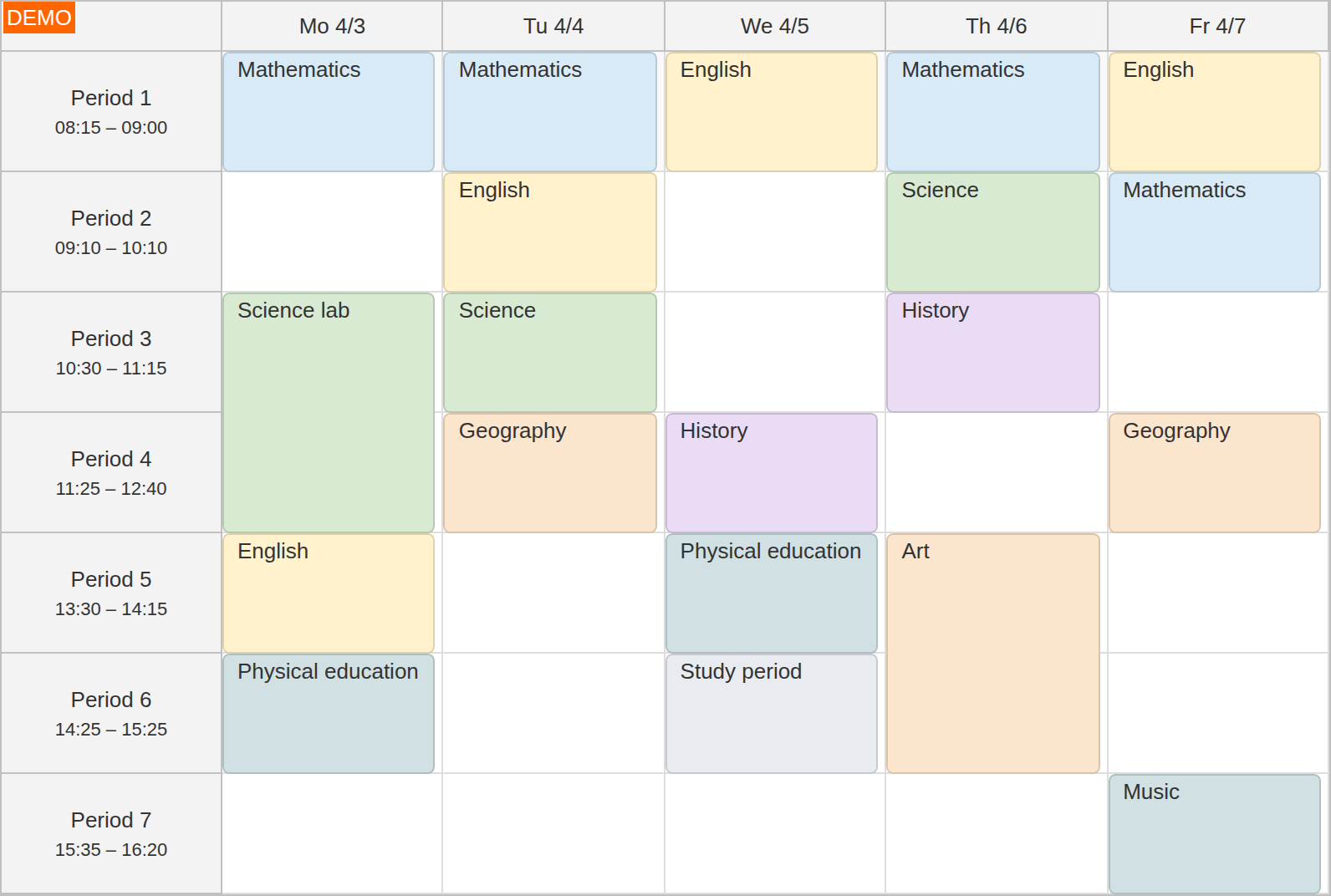
JavaScript uses a configuration object; Angular uses a typed config. React and Vue receive the individual component options. Use the Pro package for your framework.
JavaScript
const calendar = new DayPilot.Calendar("dp", {
  startDate: "2028-04-03",
  viewType: "WorkWeek",
  scale: "Manual",
  heightSpec: "Full",
  timeline: [
    {start: "2028-04-03T08:15:00", end: "2028-04-03T09:00:00", height: 72},
    {start: "2028-04-03T09:10:00", end: "2028-04-03T10:10:00", height: 72},
    {start: "2028-04-03T10:30:00", end: "2028-04-03T11:15:00", height: 72}
  ]
});
calendar.init();
Angular
Add the configuration to an existing Calendar component.
<daypilot-calendar [config]="config"></daypilot-calendar>import {DayPilot} from "daypilot-pro-angular";
config: DayPilot.CalendarConfig = {
startDate: "2028-04-03",
viewType: "WorkWeek",
scale: "Manual",
heightSpec: "Full",
timeline: [
{start: "2028-04-03T08:15:00", end: "2028-04-03T09:00:00", height: 72},
{start: "2028-04-03T09:10:00", end: "2028-04-03T10:10:00", height: 72},
{start: "2028-04-03T10:30:00", end: "2028-04-03T11:15:00", height: 72}
]
};React
import {DayPilot, DayPilotCalendar} from "daypilot-pro-react";

<DayPilotCalendar
  startDate="2028-04-03"
  viewType="WorkWeek"
  scale="Manual"
  heightSpec="Full"
  timeline={[
    {start: "2028-04-03T08:15:00", end: "2028-04-03T09:00:00", height: 72},
    {start: "2028-04-03T09:10:00", end: "2028-04-03T10:10:00", height: 72},
    {start: "2028-04-03T10:30:00", end: "2028-04-03T11:15:00", height: 72}
  ]}
/>
Vue
<script setup lang="ts">
import {DayPilot, DayPilotCalendar} from "daypilot-pro-vue";
const timeline: NonNullable<DayPilot.CalendarConfig["timeline"]> = [
    {start: "2028-04-03T08:15:00", end: "2028-04-03T09:00:00", height: 72},
    {start: "2028-04-03T09:10:00", end: "2028-04-03T10:10:00", height: 72},
    {start: "2028-04-03T10:30:00", end: "2028-04-03T11:15:00", height: 72}
  ];
</script>

<template>
  <DayPilotCalendar
    startDate="2028-04-03"
    viewType="WorkWeek"
    scale="Manual"
    heightSpec="Full"
    :timeline="timeline"
  />
</template>
Use the Same Pattern across Columns
Day, Week and WorkWeek views repeat the reference timeline on each date. In a resource calendar, a shared axis may span several days, while each column represents a person, room or other resource. Column start dates can shift the same reference pattern.
Use heightSpec "Full" for the complete axis or a fixed viewport for scrolling. Selection, moving, resizing and export follow the visible timeline. scaleManualLimitBeyond controls whether moved events may extend beyond a manual timeline's end.
Filter a Generated Timeline
For an automatically generated hour or minute scale, onIncludeTimeCell can omit or modify individual intervals. This example removes lunchtime from an 8–18 day:
scale: "Hour",
onIncludeTimeCell: args => {
  const hour = args.cell.start.getHours();
  args.cell.visible = hour >= 8 && hour < 18 && hour !== 12;
}
The handler prepares one shared vertical axis, rather than running for every resource. It controls inclusion instead of automatic showNonBusiness filtering, so include the required weekday and hour rules. The callback is not used with an explicit Manual timeline. For regular working hours and weekends, use automatic non-business-time filtering.
Headers and Break Lines
Use timeHeaders with groupBy: "Cell" for one label per timetable period, or combine Day and Hour levels for a longer resource view. See Grouped Time Headers for grouped columns.
A horizontal break marker identifies a gap. The onBeforeGridLineRender callback can recolor or hide that marker without changing the dates or cell heights:
onBeforeGridLineRender: args => {
  if (args.type === "HorizontalBreak") {
    args.hidden = true;
  }
}
Dates and Pixel Positions
Use getPixels to project a date into the grid and getDate for the reverse conversion. At a break, the end of the earlier interval and the start of the later interval share one pixel position; getDate() provides an end-boundary flag to select the earlier endpoint.
These conversions use the selected column's date offset and actual cell geometry. They avoid assuming that all hours or cells have the same height.
Demo
The Timetable demo compares equal lesson heights with heights proportional to duration. Its moving callback retains the number of lesson periods when destination periods have different lengths.
Availability
Availability of this feature in DayPilot editions:
| Product | Lite | Pro |
|---|---|---|
| DayPilot for JavaScript | ||
| DayPilot for ASP.NET WebForms | ||
| DayPilot for ASP.NET MVC | ||
| DayPilot for Java |