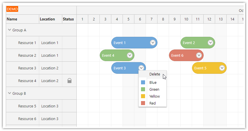
Vue Scheduler Component
The Vue Scheduler component is included in DayPilot Pro for JavaScript package.
Open-Source Tutorials
Vue Scheduler with Horizontal Timeline (Open-Source)
Build a horizontal, resource-based timeline using the open-source Vue Scheduler and customize event appearance with Vue templates and CSS.How to Add Interactive Elements to Vue Scheduler Events Using Templates
Vue templates supported by the Scheduler component allow you to add dynamic content to events, such as checkboxes, drop-down lists, or attachment upload buttons.Vue Scheduler: Undo/Redo for Drag and Drop Actions
How to add "Undo" and "Redo" buttons to the Vue Scheduler. The UndoService maintains history of changes and allows unlimited undo/redo.
Tutorials
Vue Scheduler: Build a Reservation Application in 5 Minutes
This tutorial explains how to start using the Vue Scheduler in your own application. It explains how to install and configure the component and load data.Vue Scheduler Quick Start Tutorial
A quick start project that includes all the required boilerplate code. Download this project and start playing with the Vue Scheduler component.Queue of Unscheduled Tasks
How to display a queue of unassigned tasks next to the Vue Scheduler. Users can move the unscheduled tasks to the Scheduler (and back) using drag and drop.How to Display Holidays
How to highlight global and resources-specific holidays in the Vue Scheduler. You can also disable the holiday cells for drag and drop operations.On-Demain Event Loading
How to improve performance by loading only the events for the current viewport. This feature will enable almost unlimited linear scalability.Availability/Utilization Histogram
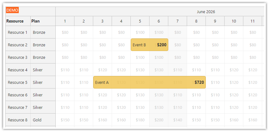
How to add special frozen rows to the top of the Vue Scheduler and display a time slot utilization histogram.
Online Configurator
You can use Scheduler UI Builder to configure the Vue Scheduler component and generate a downloadable Vue.js project.
How to install the Vue Scheduler component?
DayPilot Lite for Vue
The open-source version is available as @daypilot/daypilot-lite-vue package:
npm install @daypilot/daypilot-lite-vueDayPilot Pro for Vue
You need to install the daypilot-pro-vue package from npm.daypilot.org.
Example (make sure you use the latest version):
npm install https://npm.daypilot.org/daypilot-pro-vue/trial/2025.4.6763.tar.gzHow to add the Vue Scheduler to your application?
To add the Vue Scheduler to your application, you need to import DayPilotScheduler from daypilot-pro-vue:
import { DayPilotScheduler } from 'daypilot-pro-vue'Then you can add the <DayPilotScheduler> tag to the template:
<template>
  <DayPilotScheduler :config="config" ref="scheduler" />
</template>
How to configure the Scheduler?
You can use the :config attribute to point the Scheduler to a config object.
<DayPilotScheduler :config="config" />The config object specifies the Scheduler properties and event handlers.
const config = {
  timeHeaders: [{groupBy: "Month"}, {groupBy: "Day", format: "d"}],
  scale: "Day",
  days: DayPilot.Date.today().daysInMonth(),
  startDate: DayPilot.Date.today().firstDayOfMonth(),
  treeEnabled: true,
  onEventClick: args => {
    console.log("Event clicked", args.e);
  }
}
Since version 2024.4.6243, you can also use <DayPilotScheduler> attributes directly to set the properties in Vue 3:
<DayPilotScheduler
  :timeHeaders="[{groupBy: 'Month'}, {groupBy: 'Day', format: 'd'}]"
  :scale="'Day'"
  :days="DayPilot.Date.today().daysInMonth()"
  :startDate="DayPilot.Date.today().firstDayOfMonth()"
  :treeEnabled="true"
  @eventClick="args => console.log('Event clicked', args.e)"
/>
How to use Vue templates for Scheduler event content?
In Vue 3, you can specify the event content using Vue templates.
To define content for the event slot, use a <template> element with the #event attribute. You can access the corresponding event by destructuring the slot props using { event }.
<DayPilotScheduler :events="events" :resources="resources">
  <template #event="{ event }">
    <div class="event-text">{{ event.text() }}</div>
  </template>
</DayPilotScheduler>
You can use the Scheduler event templates to customize the event in various ways, such as:
Showing additional information in the event, like description, location, participants, progress, etc.
Customizing the styling to match your application's theme.
Adding visual elements, such as icons or images.
Rendering conditional content depending on the event data.
Adding interactive elements, such as buttons, drop-down lists, or input fields.
Translating and localizing the text content.
See also the following tutorial for a sample Vue 3 project:
How to use Vue templates for Scheduler cells?
In Vue 3, you can customize the content of scheduler cells using Vue templates. This feature allows you to define how each cell in the scheduler grid is rendered, providing flexibility to display additional information, apply custom styles, or add interactive elements.
To define content for the cell slot, use a <template> element with the #cell attribute. You can access the corresponding cell data by destructuring the slot props using { cell }.
<DayPilotScheduler :events="events" :resources="resources">
  <template #cell="{ cell }">
    <div class="cell-content">{{ cell.start.toString("ddd") }}</div>
  </template>
</DayPilotScheduler>
You can use Scheduler cell templates to customize cell content, including:
Displaying custom information within each cell, like resource details, availability status, or custom metrics.
Applying conditional styling based on cell properties, such as highlighting weekends or non-working hours.
Adding visual indicators, such as icons or badges, to represent special dates or statuses.
Rendering interactive elements inside cells, like buttons, checkboxes, or tooltips.
Tutorial
How to use Vue templates for Scheduler row headers?
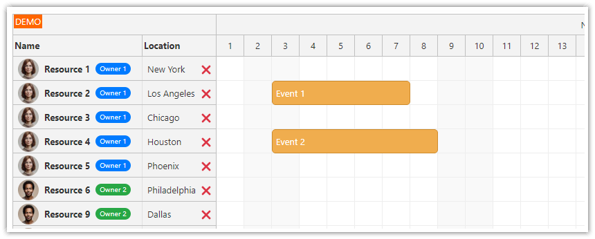
In Vue 3, you can customize the row headers of the DayPilot Scheduler component using Vue templates. This feature allows you to define how each row header is rendered, enabling you to add icons, buttons, avatars, or other custom elements to enhance the scheduler's interface.
To define content for the row header slot, use a <template> element with the #rowHeader attribute. You can access the row data by destructuring the slot props using { row, x }, where:
row: Represents the current row's data.
x: Indicates the column index or ID, useful when multiple row header columns are defined.
<DayPilotScheduler :events="events" :resources="resources">
  <template #rowHeader="{ row, x }">
    <!-- Custom row header content -->
  </template>
</DayPilotScheduler>
Use Cases for Row Header Templates
1. Displaying Additional Information: Show images, badges, or status indicators.
<template #rowHeader="{ row }">
    <img :src="row.data.icon" alt="Icon" />
    <span>{{ row.name }}</span>
</template>
2. Adding Interactive Elements: Embed buttons or icons to perform actions like editing or deleting resources directly from the row header.
<template #rowHeader="{ row }">
    <span>{{ row.name }}</span>
    <button @click="deleteResource(row.id)">Delete</button>
</template>
3. Applying Conditional Styling: Change the appearance of row headers based on specific conditions, such as highlighting important resources.
<template #rowHeader="{ row, x }">
  <div :class="{ 'highlighted': row.data.priority === 'high' }">
    {{ row.name }}
  </div>
</template>
Tutorial
Vue Scheduler: Row Header Templates tutorial with a downloadable Vue project
Vue Scheduler Component Example (Composition API)
This example shows how to use the Vue Scheduler with Composition API.
The key parts:
To use the direct API, you need a reference to the underlying DayPilot.Scheduler object. You can get it using the
refattribute.For read-only
configyou can use a plain object. If you want Vue to watchconfigobject changes, it has to be activated usingreactive().You need to return the
schedulerandconfigobjects in thesetup()function.
<template>
  <DayPilotScheduler
    ref="scheduler"
    :timeHeaders="[{ groupBy: 'Month' }, { groupBy: 'Day', format: 'd' }]"
    scale="Day"
    :days="DayPilot.Date.today().daysInMonth()"
    :startDate="DayPilot.Date.today().firstDayOfMonth()"
    timeRangeSelectedHandling="Enabled"
    :resources="resources"
    :events="events"
    @timeRangeSelected="onTimeRangeSelected"
  />
</template>

<script setup>
import { ref, onMounted } from 'vue';
import { DayPilot, DayPilotScheduler } from 'daypilot-pro-vue';

const scheduler = ref(null);

const resources = ref([]);
const events = ref([]);

async function onTimeRangeSelected(args) {
  const scheduler = args.control;
  const modal = await DayPilot.Modal.prompt('Create a new event:', 'Event 1');
  scheduler.clearSelection();
  if (modal.canceled) {
    return;
  }
  scheduler.events.add({
    start: args.start,
    end: args.end,
    id: DayPilot.guid(),
    resource: args.resource,
    text: modal.result,
  });
}

function loadResources() {
  resources.value = [
    { name: 'Resource 1', id: 'R1' },
    { name: 'Resource 2', id: 'R2' },
    { name: 'Resource 3', id: 'R3' },
  ];
}

function loadEvents() {
  events.value = [
    {
      id: 2,
      start: DayPilot.Date.today().addDays(2),
      end: DayPilot.Date.today().addDays(5),
      text: 'Event 1',
      resource: 'R2',
    },
  ];
}

onMounted(() => {
  loadResources();
  loadEvents();
  scheduler.value.control.message('Welcome!');
});
</script>
Vue Scheduler Component Example (Options API)
The following example shows a Scheduler component that uses <DayPilotScheduler> to create an instance of the Vue Scheduler using the Vue Options API.
<template>
  <DayPilotScheduler :config="config" ref="scheduler" />
</template>

<script>
import {DayPilot, DayPilotScheduler} from 'daypilot-pro-vue'

export default {
  name: 'Scheduler',
  data: function() {
    return {
      config: {
        timeHeaders: [{"groupBy":"Month"},{"groupBy":"Day","format":"d"}],
        scale: "Day",
        days: DayPilot.Date.today().daysInMonth(),
        startDate: DayPilot.Date.today().firstDayOfMonth(),
        timeRangeSelectedHandling: "Enabled",
        onTimeRangeSelected: async (args) => {
          const dp = args.control;
          const modal = await DayPilot.Modal.prompt("Create a new event:", "Event 1");
          dp.clearSelection();
          if (modal.canceled) { return; }
          dp.events.add({
            start: args.start,
            end: args.end,
            id: DayPilot.guid(),
            resource: args.resource,
            text: modal.result
          });
        },
        eventMoveHandling: "Update",
        onEventMoved: (args) => {
          args.control.message("Event moved: " + args.e.text());
        },
        eventResizeHandling: "Update",
        onEventResized: (args) => {
          args.control.message("Event resized: " + args.e.text());
        },
        eventDeleteHandling: "Update",
        onEventDeleted: (args) => {
          args.control.message("Event deleted: " + args.e.text());
        },
        eventClickHandling: "Disabled",
        treeEnabled: true,
      },
    }
  },
  props: {
  },
  components: {
    DayPilotScheduler
  },
  computed: {
    // DayPilot.Scheduler object - https://api.daypilot.org/daypilot-scheduler-class/
    scheduler: function () {
      return this.$refs.scheduler.control;
    }
  },
  methods: {
    loadEvents() {
      const events = [
        { id: 1, start: "2025-10-01T00:00:00", end: "2025-10-05T00:00:00", text: "Event 1", resource: "R1" },
      ];
      this.config.events = events;
    },
    loadResources() {
      const resources = [
        {name: "Resource 1", id: "R1"},
        {name: "Resource 2", id: "R2"},
        {name: "Resource 3", id: "R3"}
      ];
      this.config.resources = resources;
    }
  },
  mounted: function() {
    this.loadResources();
    this.loadEvents();

    this.scheduler.message("Welcome!");
  }
}
</script>
Availability
Availability of this feature in DayPilot editions:
| Lite | Pro | |
|---|---|---|
| DayPilot for JavaScript | ||
| DayPilot for ASP.NET WebForms | ||
| DayPilot for ASP.NET MVC | ||
| DayPilot for Java |
 DayPilot
