 DayPilot
The React Scheduler displays bookings, shifts, and tasks on a horizontal resource timeline. Connect it to React state, callbacks, and custom JSX content.
The component is available in DayPilot Lite (open-source, Apache License 2.0) and DayPilot Pro (commercial). Both include React integration and TypeScript declarations.
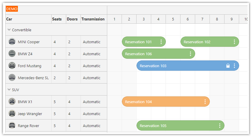
React Scheduler Features
A resource timeline. Display people, rooms, machines, or other resources as rows, with time running horizontally. Configure the visible range, time headers, and cell duration for daily or longer-term planning.
Drag-and-drop scheduling. Let users select free time, create events, move them between rows, or resize their duration. Use callbacks to save the changes to your application backend.
React content. Render JSX in events, grid cells, row headers, time headers, and the corner. Event colors, active areas, context menus, and CSS themes provide additional customization options.
Loading and navigation. Supply event/resource arrays from React state, navigate between dates, and load data for the visible range. Progressive rendering limits the work needed to draw large schedules.
Additional Pro Options
Pro adds hierarchical resources, dependency links, event versions, advanced drag-and-drop rules, dynamic loading, and export options. Features such as hotel availability rules, pricing, and undo history still belong to your application.
See the feature matrix for a detailed edition comparison.
For time running vertically, with days or resources as columns, use the React Calendar.
Demos and Tutorials
Each tutorial includes a downloadable project. The edition used by the example is shown beside its link.
Getting Started
React Scheduler with Horizontal Timeline (Open-Source) · Live demo (Lite)
Start with a resource timeline, date navigation, themes, and event editing.React Scheduler: TypeScript Project · Live demo (Lite)
Build a typed React scheduling component with resources and event data.React Scheduler Component Tutorial · Live demo (Pro)
Explore a complete React Scheduler starter with a resource timeline.Next.js Scheduler with Horizontal Timeline (Open-Source) · Live demo (Lite)
Use the open-source horizontal Scheduler in a Next.js client interface.Next.js Scheduler with DayPilot: A Step-by-Step Guide · Live demo (Pro)
Add a Pro Scheduler to a Next.js application.
Custom Content and Navigation
React Scheduler: Rendering JSX in Events · Live demo (Lite)
Add interactive React content inside event boxes.React JSX Components in Scheduler Grid Cells (Lite)
Display React content, text, and active areas in grid cells.React Scheduler: Rendering JSX Components in Row Headers · Live demo (Lite)
Render custom React content in resource row headers.React Scheduler: Rendering JSX in Time Header and Upper-Left Corner · Live demo (Lite)
Render React components in time headers and the upper-left corner.React Scheduler: Next/Previous Buttons · Live demo (Lite)
Change the visible date range with previous and next buttons.React Scheduler: How to Enable Undo/Redo · Live demo (Lite)
Implement application-managed undo and redo for scheduling changes.
Planning Features
React Scheduler: How to Manage Resources · Live demo (Pro)
Add, edit, move, and delete resource rows using application controls.React Scheduler: Visually Connect Tasks using Links · Live demo (Pro)
Display and edit links between scheduled tasks, including link styling.React Scheduler: External Drag and Drop · Live demo (Pro)
Drag external items into a resource schedule.React Scheduler: Full Screen Layout · Live demo (Pro)
Fit the Scheduler into a page with a fixed toolbar and available-height layout.React Scheduler: How to Display Slot Details using Background Events · Live demo (Pro)
Display noninteractive background events behind the scheduled work.React Scheduler: How to Search Events · Live demo (Pro)
Find matching events and highlight or navigate to search results.React: Milestone Scheduler · Live demo (Pro)
Display date-based milestones for resources.React Scheduler: PDF Export/Printing · Live demo (Pro)
Create a multipage PDF using the Pro export API and a PDF library.
Backend Applications and Additional Recipes
React Shift Scheduling Application (PHP/MySQL Backend) (Pro)
Load and save staff shifts with a PHP backend and database.React: Activity Planning System (Node, Express, PostgreSQL) (Pro)
Connect activity planning to a Node/Express API and PostgreSQL.React Work Order Planning System (PHP/MySQL) (Pro)
Plan work orders with a PHP/MySQL backend. This download uses older Create React App scaffolding.React Scheduler: Rendering JSX Component in Callout (Bubble) (Pro)
Render React content in a callout bubble. This recipe uses older Create React App scaffolding.
Compare Planned and Actual Schedules
Next.js Scheduler: Planned vs. Actual Task Durations · Live demo (Pro)
Display a saved plan alongside current tasks using event versions. The sample implements the planning and tracking workflow.
Configure a Starter Project
Use Scheduler UI Builder to explore settings in a live preview and download a React starter. Select the edition that matches your application. Continue adjusting the generated configuration in your own code.
Installation
DayPilot Lite
Install @daypilot/daypilot-lite-react from npm:
npm install @daypilot/daypilot-lite-reactDayPilot Pro
At npm.daypilot.org, select React and copy the installation command for daypilot-pro-react. Licensed customers can obtain their package URL in the customer area.
The examples use JavaScript/JSX and function components with React 18 or later.
Display Room Reservations
Two rooms appear as rows. Each cell is one day, so the multi-day bookings are easy to see.
Scheduler.jsx
import {useState} from 'react';
import {DayPilot, DayPilotScheduler} from '@daypilot/daypilot-lite-react';

export default function Scheduler() {
  const [events] = useState([
    {id: 1, text: 'Reservation A', resource: 'R1',
      start: '2026-10-05', end: '2026-10-08'},
    {id: 2, text: 'Reservation B', resource: 'R2',
      start: '2026-10-20', end: '2026-10-23'}
  ]);

  const [resources] = useState([{id: 'R1', name: 'Room 1'}, {id: 'R2', name: 'Room 2'}]);

  return <DayPilotScheduler
    startDate="2026-10-01"
    days={31}
    scale="Day"
    timeHeaders={[{groupBy: 'Month'}, {groupBy: 'Day', format: 'd'}]}
    events={events}
    resources={resources}
  />;
}
The resource on each event matches a resource ID. startDate, days and scale define the timeline; timeHeaders label its month and days. Reservation A occupies October 5–7 because its end is exclusive.
The examples use Lite. For Pro, change the package import to daypilot-pro-react.
See event loading and resource loading for data formats and loading options.
Navigate and Load Reservations
Previous and Next change the month and load its reservations. The endpoint returns {resources: [...], events: [...]}; keeping both collections in the same response avoids showing bookings against an unrelated resource list.
SchedulerLoading.jsx
import {useState, useEffect} from 'react';
import {DayPilot, DayPilotScheduler} from '@daypilot/daypilot-lite-react';

export default function Scheduler() {
  const [startDate, setStartDate] = useState(new DayPilot.Date('2026-10-01'));

  const [events, setEvents] = useState([]);

  const [resources, setResources] = useState([]);

  useEffect(() => {
    let active = true;
    const start = startDate;
    const end = start.addMonths(1);
    const url = `/api/schedule?start=${start}&end=${end}`;
    async function load() {
      try {
        const {data} = await DayPilot.Http.get(url);
        if (!active) { return; }
        setResources(data.resources);
        setEvents(data.events);
      } catch {
        if (active) { await DayPilot.Modal.alert('Could not load data.'); }
      }
    }
    load();
    return () => { active = false; };
  }, [startDate]);

  function navigate(offset) {
    setStartDate(date => date.addMonths(offset));
  }

  return <>
    <button onClick={() => navigate(-1)}>Previous month</button>
    <button onClick={() => navigate(1)}>Next month</button>
    <DayPilotScheduler
      startDate={startDate}
      days={startDate.daysInMonth()}
      scale="Day"
      timeHeaders={[{groupBy: 'Month'}, {groupBy: 'Day', format: 'd'}]}
      events={events}
      resources={resources}
    />
  </>;
}
The /api/schedule URL represents your own backend. Return items that overlap the requested range: item start is before the requested end, and item end is after the requested start. Failed requests display a DayPilot dialog.
The effect cleanup prevents an older response from replacing data after another navigation action.
For large schedules, Pro also supports dynamic event loading as the user scrolls. That is separate from replacing the events for a new month.
Create Reservations by Selecting Time
This complete variation of the first example handles time range selection. The selection supplies the dates and resource; the dialog supplies the name.
SchedulerCreation.jsx
import {useState} from 'react';
import {DayPilot, DayPilotScheduler} from '@daypilot/daypilot-lite-react';

export default function Scheduler() {
  const [events] = useState([
    {id: 1, text: 'Reservation A', resource: 'R1',
      start: '2026-10-05', end: '2026-10-08'},
    {id: 2, text: 'Reservation B', resource: 'R2',
      start: '2026-10-20', end: '2026-10-23'}
  ]);

  const [resources] = useState([{id: 'R1', name: 'Room 1'}, {id: 'R2', name: 'Room 2'}]);

  return <DayPilotScheduler
    startDate="2026-10-01"
    days={31}
    scale="Day"
    timeHeaders={[{groupBy: 'Month'}, {groupBy: 'Day', format: 'd'}]}
    events={events}
    resources={resources}
    onTimeRangeSelected={async args => {
      const modal = await DayPilot.Modal.prompt('Reservation name:', 'New reservation');
      args.control.clearSelection();
      if (modal.canceled) { return; }
      args.control.events.add({
        id: DayPilot.guid(), text: modal.result,
        start: args.start, end: args.end, resource: args.resource
      });
    }}
  />;
}
Canceling the dialog leaves the data unchanged. events.add() inserts the new event locally. In an application with a backend, create the record with a POST request and use the returned ID before adding it to the view.
Move, Resize and Save Events
Moving changes the event position; resizing changes its duration. Both work in the first example without extra configuration. The component updates the display and the supplied data object automatically.
Use the callbacks after the edit to persist the result. This example sends the changed record to the backend; it does not reload the collection after each drag.
SchedulerSaving.jsx
import {useState} from 'react';
import {DayPilot, DayPilotScheduler} from '@daypilot/daypilot-lite-react';

export default function Scheduler() {
  const [events] = useState([
    {id: 1, text: 'Reservation A', resource: 'R1',
      start: '2026-10-05', end: '2026-10-08'},
    {id: 2, text: 'Reservation B', resource: 'R2',
      start: '2026-10-20', end: '2026-10-23'}
  ]);

  const [resources] = useState([{id: 'R1', name: 'Room 1'}, {id: 'R2', name: 'Room 2'}]);

  async function saveEvent(data) {
    try {
      await DayPilot.Http.put(`/api/events/${data.id}`, data);
    } catch {
      await DayPilot.Modal.alert('The change could not be saved.');
    }
  }

  return <DayPilotScheduler
    startDate="2026-10-01"
    days={31}
    scale="Day"
    timeHeaders={[{groupBy: 'Month'}, {groupBy: 'Day', format: 'd'}]}
    events={events}
    resources={resources}
    onEventMoved={args => saveEvent(args.e.data)}
    onEventResized={args => saveEvent(args.e.data)}
  />;
}
The /api/events/{id} endpoint accepts the updated JSON record. A failed save is reported while the local edit remains visible; add retry or rollback behavior to suit your application. To disable an interaction, set eventMoveHandling or eventResizeHandling to "Disabled".
Handle a Event Click
To display the clicked item’s name, add this prop to the existing component:
onEventClick={args => DayPilot.Modal.alert(DayPilot.Util.escapeHtml(args.e.text()))}DayPilot.Modal.alert() accepts HTML. escapeHtml() displays the item’s name as plain text.
Render Custom React Content
This independent variation of the first example adds JSX to the event through onBeforeEventDomAdd.
SchedulerContent.jsx
import {useState} from 'react';
import {DayPilot, DayPilotScheduler} from '@daypilot/daypilot-lite-react';

export default function Scheduler() {
  const [events] = useState([
    {id: 1, text: 'Reservation A', resource: 'R1',
      start: '2026-10-05', end: '2026-10-08'},
    {id: 2, text: 'Reservation B', resource: 'R2',
      start: '2026-10-20', end: '2026-10-23'}
  ]);

  const [resources] = useState([{id: 'R1', name: 'Room 1'}, {id: 'R2', name: 'Room 2'}]);

  return <DayPilotScheduler
    startDate="2026-10-01"
    days={31}
    scale="Day"
    timeHeaders={[{groupBy: 'Month'}, {groupBy: 'Day', format: 'd'}]}
    events={events}
    resources={resources}
    onBeforeEventDomAdd={args => {
      args.element = <strong>{args.e.text()}</strong>;
    }}
  />;
}
Access the Scheduler API
Find Reservation B by ID and scroll the timeline to its start. This is useful when a booking or task lies outside the current horizontal viewport.
SchedulerApi.jsx
import {useState} from 'react';
import {DayPilot, DayPilotScheduler} from '@daypilot/daypilot-lite-react';

export default function Scheduler() {
  const [scheduler, setScheduler] = useState(null);

  const [events] = useState([
    {id: 1, text: 'Reservation A', resource: 'R1',
      start: '2026-10-05', end: '2026-10-08'},
    {id: 2, text: 'Reservation B', resource: 'R2',
      start: '2026-10-20', end: '2026-10-23'}
  ]);

  const [resources] = useState([{id: 'R1', name: 'Room 1'}, {id: 'R2', name: 'Room 2'}]);

  function showReservation() {
    const control = scheduler;
    const event = control.events.find(2);
    control.scrollTo(event.start());
  }

  return <>
    <button disabled={!scheduler} onClick={showReservation}>Show reservation B</button>
    <DayPilotScheduler
      startDate="2026-10-01"
      days={31}
      scale="Day"
      timeHeaders={[{groupBy: 'Month'}, {groupBy: 'Day', format: 'd'}]}
      events={events}
      resources={resources}
      controlRef={setScheduler}
    />
  </>;
}
React receives the underlying control through controlRef. The wrapper creates and disposes it. See the DayPilot.Scheduler API for methods, properties and callbacks.
Use Next.js
Place the introductory component in Scheduler.jsx and add 'use client'; at the top. Create a client wrapper that loads it with server rendering disabled:
SchedulerClient.jsx
'use client';

import dynamic from 'next/dynamic';

const Scheduler = dynamic(() => import('./Scheduler'), {ssr: false});

export default function SchedulerClient() {
  return <Scheduler />;
}
Import SchedulerClient in your page and render <SchedulerClient />. The Next.js client wrapper keeps the DayPilot component in the browser. The tutorials above provide complete project setups.
Availability
Availability of this feature in DayPilot editions:
| Product | Lite | Pro |
|---|---|---|
| DayPilot for JavaScript | ||
| DayPilot for ASP.NET WebForms | ||
| DayPilot for ASP.NET MVC | ||
| DayPilot for Java |