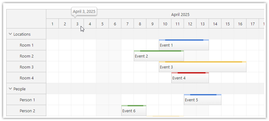
You can add custom visual elements to the Scheduler time header cells using active areas.
Visual Appearance
Active areas can be visually represented as:
Icons: These can be SVG symbols or font icons.
Images: You can use common image formats like JPEG, PNG, or SVG.
Color Bars: These can be vertical or horizontal and used for marking time.
Text: You can place custom text at the specified position.
Rich HTML content: Add custom content defined using raw HTML.
Time-Based Segments: Set start and end times using date values instead of pixels.
The position can be defined using pixels (relative to the top, bottom, left, right) or using date/time values (replacing left, right, width values).
Uses
You can use active areas to:
Show Status Icons: Display icons representing a status for a time slot.
Highlight Time Slots: Use color bars to highlight specific time slots, such as public holidays or busy periods.
Provide Tooltips: Display a hover tooltip that provides extra details about a time cell, like its utilization or special notes.
Add Context Menus: Introduce a context menu offering additional actions, such as blocking or disabling a specific time slot.
Create Custom Segments: Create specific time units not supported by the standard time header units.
Select Time Columns: Add a button to select an entire column of time.
Filter Rows: Add a button allowing users to filter rows based on data or the availability of a chosen time slot.
Supported Actions
Active areas can initiate:
Bubbles on Hover: Show a bubble or pop-up when hovered over.
Context Menus: Display a menu with options.
Custom Code: Run specific code defined using an event handler.
Visibility Options
Active areas can be:
Permanently Visible: Always seen on the interface.
Visible on Hover: Seen only when hovered over.
Visible on Touch Devices: Always seen on touch devices, but on hover for non-touch devices.
With these active areas, the scheduler's time header becomes more functional and user-friendly, allowing for better navigation and interaction.
Defining Active Areas
You can create time header active areas using the onBeforeTimeHeaderRender event handler.
Define the active areas using
args.header.areasarray.Each active area object supports properties described at the DayPilot.Area documentation page.
Example: Info Icon

This example shows a text-based icons on the right side of the time header cells in the first row (args.header.level === 0).
Upon clicking, the active area shows a modal dialog with the cell start and end date/time.
onBeforeTimeHeaderRender: args => {
    if (args.header.level === 0) {
        const style = "text-align: center; font-weight: bold; cursor: pointer; border-radius: 10px; border: 1px solid #ccc; background-color: #fff;";
        args.header.areas = [
            {
                right: 6,
                top: 6,
                height: 16,
                width: 16,
                html: "i",
                style: style,
                action: "None",
                onClick: args => {
                    const header = args.source;
                    console.log(args);
                    DayPilot.Modal.alert('Time slot clicked: ' + header.start.toString('yyyy-MM-dd HH:mm:ss') + ' - ' + header.end.toString('yyyy-MM-dd HH:mm:ss'));
                }
            },
        ];
    }
}
Example: Custom Time Segments

This example shows three 10-day segments in the second time header row, each using a different color:
Configuration:
timeHeaders: [
    {groupBy: "Month", format: "MMMM yyyy"},
    {groupBy: "Month", height: 24}
],
onBeforeTimeHeaderRender: args => {
     if (args.header.level === 1) {
        const point1 = args.header.start.addDays(10);
        const point2 = args.header.start.addDays(20);
        const padding = 3;
        args.header.areas = [
            {start: args.header.start, end: point1, top: padding, bottom: padding, backColor: "#cc0000", style: "border-radius: 10px;"},
            {start: point1, end: point2, top: padding, bottom: padding, backColor: "#f1c232", style: "border-radius: 10px;"},
            {start: point2, end: args.header.end, top: padding, bottom: padding, backColor: "#6aa84f", style: "border-radius: 10px;"},
        ];

        args.header.html = "";
    }
}
Example: Display Callout on Hover

This example creates a transparent active area that fills the whole time header cells. The bubble property of the active area defines a custom callout using DayPilot.Bubble that will be displayed on hover.
timeHeaders: [
    {groupBy: "Month", format: "MMMM yyyy"},
    {groupBy: "Day", format: "d"}
],
onBeforeTimeHeaderRender: args => {
    if (args.header.level === 1) {
        args.header.toolTip = "";
        args.header.areas = [
            {
                left: 0,
                top: 0,
                right: 0,
                bottom: 0,
                bubble: new DayPilot.Bubble({
                    onLoad: (bargs) => {
                        bargs.html = args.header.start.toString("MMMM d, yyyy");
                    }
                })
            }
        ];
    }
}
Availability
Availability of this feature in DayPilot editions:
| Lite | Pro | |
|---|---|---|
| DayPilot for JavaScript | ||
| DayPilot for ASP.NET WebForms | ||
| DayPilot for ASP.NET MVC | ||
| DayPilot for Java |
 DayPilot