 DayPilot
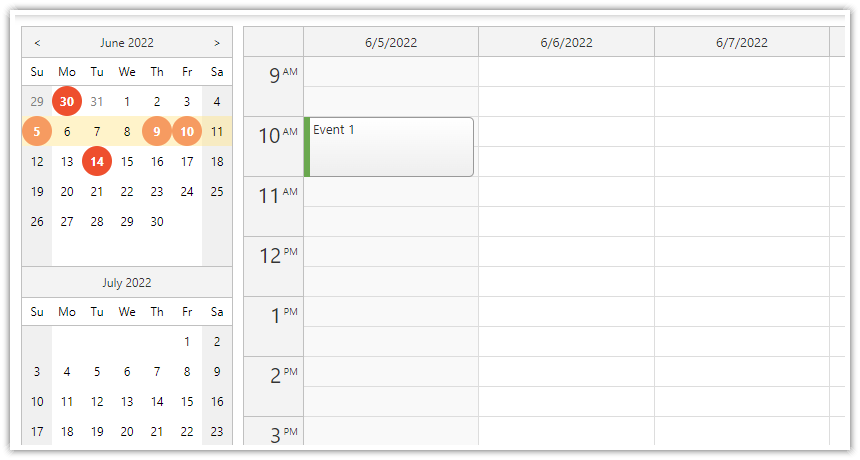
The Vue date picker (DayPilot Navigator) lets users choose a day or date range and navigate a larger scheduling interface. It can display several months and highlight dates that already contain events.
The component is available in DayPilot Lite (open-source, Apache License 2.0) and DayPilot Pro (commercial). Both include Vue integration and TypeScript declarations.
Vue Date Picker Features
Day, week, and month selection. Use
selectModeto match the view in the main calendar. EnablefreeHandSelectionEnabledwhen users need to drag across an arbitrary date range.One or several months. Set
showMonthsto control how many months are visible andskipMonthsto control the arrow-navigation step. Choose vertical or horizontal orientation.Free/busy highlighting. Supply event data to mark days with scheduled events. The default theme uses bold text; CSS and
onBeforeCellRendercan customize the appearance. A busy marker does not by itself prevent selection.Calendar integration. Use the selected date or range to update Calendar, Month, or Scheduler. Load enough event data for the Navigator’s entire visible range if every displayed month needs accurate busy markers.
Demos and Tutorials
Each tutorial includes a downloadable project. The edition used by the example is shown beside its link.
Free/Busy and Calendar Navigation
Vue Date Picker with Free/Busy Highlighting (Open-Source) · Live demo (Lite)
Share event data with a date picker and highlight busy dates.Vue.js Weekly Calendar Tutorial (Open-Source) · Live demo (Lite)
Build a weekly calendar with date navigation and event editing.Vue Calendar: Day/Week/Month Views (Open-Source) · Live demo (Lite)
Connect day, week, and month views to shared event data and a date picker.
Installation
DayPilot Lite
Install @daypilot/daypilot-lite-vue from npm:
npm install @daypilot/daypilot-lite-vueDayPilot Pro
At npm.daypilot.org, select Vue and copy the installation command for daypilot-pro-vue. Licensed customers can obtain their package URL in the customer area.
The examples use Vue 3 and the Composition API with <script setup>.
Select a Date
Choose a date in the Navigator. The text below it shows the selected day.
Navigator.vue
<script setup>
import {ref} from 'vue';
import {DayPilotNavigator} from '@daypilot/daypilot-lite-vue';

const selectedDay = ref('2026-10-05');

function onTimeRangeSelected(args) {
  selectedDay.value = args.day.toString('yyyy-MM-dd');
}
</script>

<template>
  <DayPilotNavigator
    startDate="2026-10-01"
    :showMonths="2"
    :skipMonths="1"
    selectMode="Day"
    :selectionDay="selectedDay"
    @timeRangeSelected="onTimeRangeSelected"
  />
  <p>Selected day: {{ selectedDay }}</p>
</template>
The selected date and visible months are separate settings. startDate sets the first displayed month, showMonths sets the number of months, and skipMonths sets the navigation step. selectionDay supplies the selected date; the callback returns the clicked date in args.day.
These examples use Lite. For Pro, change the import to daypilot-pro-vue.
Connect a Calendar and Highlight Busy Dates
Use one selected date to control the week shown by the Calendar, and one event collection for both components. The Navigator highlights dates with events. Select another week to change the Calendar; move an appointment to update its date and the Navigator’s busy marker.
NavigatorConnected.vue
<script setup>
import {ref} from 'vue';
import {DayPilotNavigator, DayPilotCalendar} from '@daypilot/daypilot-lite-vue';

const selectedDay = ref('2026-10-05');
const events = ref([
  {id: 'meeting', text: 'Meeting',
    start: '2026-10-05T10:00:00', end: '2026-10-05T12:00:00'}
]);

function selectWeek(args) {
  selectedDay.value = args.day.toString();
}

function refreshBusyDates(args) {
  events.value = [...args.control.events.list];
}
</script>

<template>
  <DayPilotNavigator
    startDate="2026-10-01"
    :showMonths="2"
    :skipMonths="1"
    selectMode="Week"
    :weekStarts="1"
    :selectionDay="selectedDay"
    :events="events"
    @timeRangeSelected="selectWeek"
  />
  <DayPilotCalendar
    :startDate="selectedDay"
    viewType="Week"
    :weekStarts="1"
    :events="events"
    @eventMoved="refreshBusyDates"
    @eventResized="refreshBusyDates"
  />
</template>
The Calendar moves and resizes events automatically. The callbacks here notify the second component that its busy-date data changed. They are useful because the Navigator is another consumer of the collection; the Calendar needs no callback merely to display its own edit.
Use the same weekStarts value in both components. For a monthly view, connect a Month component and set selectMode: "Month". See binding to a main control and selection modes.
Busy-day highlighting marks dates represented in the supplied data; it does not disable empty dates. In a backend application, load events for all displayed Navigator months, including visible days from adjacent months. Use visibleStart()/visibleEnd() and reload after onVisibleRangeChanged. Loading only the selected Calendar week would incorrectly make other dates look free.
Add a Busy Marker with a Vue Template
This variation keeps the same Calendar connection and adds a marker to busy cells. The Navigator already displays the day number, so the slot only adds the dot.
NavigatorContent.vue
<script setup>
import {ref} from 'vue';
import {DayPilotNavigator, DayPilotCalendar} from '@daypilot/daypilot-lite-vue';

const selectedDay = ref('2026-10-05');
const events = ref([
  {id: 'meeting', text: 'Meeting',
    start: '2026-10-05T10:00:00', end: '2026-10-05T12:00:00'}
]);

function selectWeek(args) {
  selectedDay.value = args.day.toString();
}

function refreshBusyDates(args) {
  events.value = [...args.control.events.list];
}
</script>

<template>
  <DayPilotNavigator
    startDate="2026-10-01"
    :showMonths="2"
    :skipMonths="1"
    selectMode="Week"
    :weekStarts="1"
    :selectionDay="selectedDay"
    :events="events"
    @timeRangeSelected="selectWeek"
  >
    <template #cell="{cell}">
      <small v-if="cell.events.all().length">•</small>
    </template>
  </DayPilotNavigator>
  <DayPilotCalendar
    :startDate="selectedDay"
    viewType="Week"
    :weekStarts="1"
    :events="events"
    @eventMoved="refreshBusyDates"
    @eventResized="refreshBusyDates"
  />
</template>
The cell slot provides day, isToday, isWeekend, isCurrentMonth and events.all(). Pro templates also track reactive parent values and refresh their content when those values change.
Select a Custom Date Range
For a date-range picker, enable freeHandSelectionEnabled. This is a separate complete example: drag across several days to display the selected range.
NavigatorRange.vue
<script setup>
import {ref} from 'vue';
import {DayPilotNavigator} from '@daypilot/daypilot-lite-vue';

const range = ref('');

function selectRange(args) {
  range.value = args.start.toString('yyyy-MM-dd') + ' – ' +
    args.end.toString('yyyy-MM-dd');
}
</script>

<template>
  <DayPilotNavigator
    startDate="2026-10-01"
    :freeHandSelectionEnabled="true"
    @timeRangeSelected="selectRange"
  />
  <p>{{ range }}</p>
</template>
args.end is exclusive. Selecting October 12–14 therefore returns October 15 as the end. args.days gives the number of selected days. Use the range to filter application data or configure a custom-length main view.
Select Today Using the Navigator API
The select() method changes the selection, brings it into view and triggers the selection callback. This Today button therefore also updates the selected-day text.
NavigatorApi.vue
<script setup>
import {ref} from 'vue';
import {DayPilot, DayPilotNavigator} from '@daypilot/daypilot-lite-vue';

const navigator = ref(null);

const selectedDay = ref('2026-10-05');

function onTimeRangeSelected(args) {
  selectedDay.value = args.day.toString('yyyy-MM-dd');
}
</script>

<template>
  <button @click="navigator.control.select(DayPilot.Date.today())">Today</button>
  <DayPilotNavigator ref="navigator"
    startDate="2026-10-01"
    :showMonths="2"
    :skipMonths="1"
    selectMode="Day"
    :selectionDay="selectedDay"
    @timeRangeSelected="onTimeRangeSelected"
  />
  <p>Selected day: {{ selectedDay }}</p>
</template>
The wrapper manages initialization and disposal. The template ref exposes the JavaScript control as navigator.value.control inside the script. See select() and the Navigator API.
Availability
Availability of this feature in DayPilot editions:
| Product | Lite | Pro |
|---|---|---|
| DayPilot for JavaScript | ||
| DayPilot for ASP.NET WebForms | ||
| DayPilot for ASP.NET MVC | ||
| DayPilot for Java |