 DayPilot
The React monthly calendar displays events in a familiar month grid. It works well for leave planning, reservations, reminders, and milestones, including events that span several days.
The component is available in DayPilot Lite (open-source, Apache License 2.0) and DayPilot Pro (commercial). Both include React integration and TypeScript declarations.
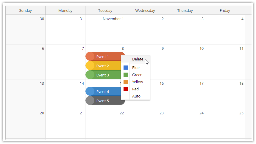
React Monthly Calendar Features
A complete month at a glance. Show daily cells with appointments, reminders, and events spanning multiple days. Events that cross a week boundary continue on the following row.
Interactive scheduling. Let users select days to create an event, move events to another date, and resize their duration. Your application chooses the editor and saves the result.
Custom appearance. Set event colors, customize cell appearance, and use a context menu for application actions. Locales and the first-day-of-week setting adapt the display to your users.
Connected views. Share event data with the day/week Calendar and use the Navigator date picker to change the displayed month.
Additional Pro Options
Pro adds advanced scheduling and export options, including image export and Excel export. Choose the edition according to the required interactions and output formats; the core monthly view and ordinary event editing are available in both.
See the feature matrix for a detailed edition comparison.
Demos and Tutorials
Each tutorial includes a downloadable project. The edition used by the example is shown beside its link.
React and Next.js Examples
React Monthly Calendar Tutorial (Open-Source) · Live demo (Lite)
Build a monthly event calendar with custom colors, context menus, and editing.React Calendar with Day/Week/Month Views (Open-Source) · Live demo (Lite)
Switch between day, week, and month views with one event collection.Next.js Monthly Calendar (Open-Source) · Live demo (Lite)
Build a monthly scheduling interface in a Next.js client component.Next.js Calendar with Day/Week/Month Views (Open-Source) · Live demo (Lite)
Combine daily, weekly, and monthly views in Next.js.
Configure a Starter Project
Use Month UI Builder to explore settings in a live preview and download a React starter. Select the edition that matches your application. Continue adjusting the generated configuration in your own code.
Installation
DayPilot Lite
Install @daypilot/daypilot-lite-react from npm:
npm install @daypilot/daypilot-lite-reactDayPilot Pro
At npm.daypilot.org, select React and copy the installation command for daypilot-pro-react. Licensed customers can obtain their package URL in the customer area.
The examples use JavaScript/JSX and function components with React 18 or later.
Display a Monthly Calendar
This calendar shows a three-day conference in October.
Month.jsx
import {useState} from 'react';
import {DayPilot, DayPilotMonth} from '@daypilot/daypilot-lite-react';

export default function Month() {
  const [events] = useState([
    {id: 'conference', text: 'Conference', start: '2026-10-05', end: '2026-10-08'}
  ]);

  return <DayPilotMonth
    startDate="2026-10-01"
    weekStarts={1}
    events={events}
  />;
}
startDate selects the month; weekStarts: 1 starts each row on Monday. The conference occupies October 5–7: its October 8 end is exclusive. The grid also displays dates from adjacent months to fill its first and last weeks.
The examples use Lite. For Pro, change the package import to daypilot-pro-react.
See event loading for data formats and loading options.
Load the Full Visible Month
Navigation changes the month before reading visibleStart() and visibleEnd(). These methods include the adjacent-month days in the grid. Request events that overlap this entire range, rather than only events inside the named month.
MonthLoading.jsx
import {useState, useEffect} from 'react';
import {DayPilot, DayPilotMonth} from '@daypilot/daypilot-lite-react';

export default function Month() {
  const [startDate, setStartDate] = useState(new DayPilot.Date('2026-10-01'));

  const [month, setMonth] = useState(null);

  const [events, setEvents] = useState([]);

  useEffect(() => {
    if (!month) { return; }
    let active = true;
    const start = month.visibleStart();
    const end = month.visibleEnd();
    const url = `/api/events?start=${start}&end=${end}`;
    async function load() {
      try {
        const {data} = await DayPilot.Http.get(url);
        if (!active) { return; }
        setEvents(data);
      } catch {
        if (active) { await DayPilot.Modal.alert('Could not load data.'); }
      }
    }
    load();
    return () => { active = false; };
  }, [month, startDate]);

  function navigate(offset) {
    setStartDate(date => date.addMonths(offset));
  }

  return <>
    <button onClick={() => navigate(-1)}>Previous month</button>
    <button onClick={() => navigate(1)}>Next month</button>
    <DayPilotMonth
      startDate={startDate}
      weekStarts={1}
      events={events}
      controlRef={setMonth}
    />
  </>;
}
The /api/events URL represents your own backend. Return items that overlap the requested range: item start is before the requested end, and item end is after the requested start. Failed requests display a DayPilot dialog.
The effect cleanup prevents an older response from replacing data after another navigation action.
React runs this effect after the updated date has reached the Month component.
Create Events by Selecting Time
This complete variation of the first example handles time range selection. The selection supplies the dates; the dialog supplies the name.
MonthCreation.jsx
import {useState} from 'react';
import {DayPilot, DayPilotMonth} from '@daypilot/daypilot-lite-react';

export default function Month() {
  const [events] = useState([
    {id: 'conference', text: 'Conference', start: '2026-10-05', end: '2026-10-08'}
  ]);

  return <DayPilotMonth
    startDate="2026-10-01"
    weekStarts={1}
    events={events}
    onTimeRangeSelected={async args => {
      const modal = await DayPilot.Modal.prompt('Event name:', 'New event');
      args.control.clearSelection();
      if (modal.canceled) { return; }
      args.control.events.add({
        id: DayPilot.guid(), text: modal.result,
        start: args.start, end: args.end
      });
    }}
  />;
}
Canceling the dialog leaves the data unchanged. events.add() inserts the new event locally. In an application with a backend, create the record with a POST request and use the returned ID before adding it to the view.
Move, Resize and Save Events
Moving changes the event position; resizing changes its duration. Both work in the first example without extra configuration. The component updates the display and the supplied data object automatically.
Use the callbacks after the edit to persist the result. This example sends the changed record to the backend; it does not reload the collection after each drag.
MonthSaving.jsx
import {useState} from 'react';
import {DayPilot, DayPilotMonth} from '@daypilot/daypilot-lite-react';

export default function Month() {
  const [events] = useState([
    {id: 'conference', text: 'Conference', start: '2026-10-05', end: '2026-10-08'}
  ]);

  async function saveEvent(data) {
    try {
      await DayPilot.Http.put(`/api/events/${data.id}`, data);
    } catch {
      await DayPilot.Modal.alert('The change could not be saved.');
    }
  }

  return <DayPilotMonth
    startDate="2026-10-01"
    weekStarts={1}
    events={events}
    onEventMoved={args => saveEvent(args.e.data)}
    onEventResized={args => saveEvent(args.e.data)}
  />;
}
The /api/events/{id} endpoint accepts the updated JSON record. A failed save is reported while the local edit remains visible; add retry or rollback behavior to suit your application. To disable an interaction, set eventMoveHandling or eventResizeHandling to "Disabled".
Handle a Event Click
To display the clicked item’s name, add this prop to the existing component:
onEventClick={args => DayPilot.Modal.alert(DayPilot.Util.escapeHtml(args.e.text()))}DayPilot.Modal.alert() accepts HTML. escapeHtml() displays the item’s name as plain text.
Render Custom React Content
This independent variation of the first example adds JSX to the event through onBeforeEventDomAdd. It uses the Pro package; Lite does not provide this JSX event hook for Month.
MonthContent.jsx
import {useState} from 'react';
import {DayPilot, DayPilotMonth} from 'daypilot-pro-react';

export default function Month() {
  const [events] = useState([
    {id: 'conference', text: 'Conference', start: '2026-10-05', end: '2026-10-08'}
  ]);

  return <DayPilotMonth
    startDate="2026-10-01"
    weekStarts={1}
    events={events}
    onBeforeEventDomAdd={args => {
      args.element = <strong>{args.e.text()}</strong>;
    }}
  />;
}
Access the Month API
Use the event collection API to find and rename the conference. The wrapper reference, button and handler are shown together.
MonthApi.jsx
import {useState} from 'react';
import {DayPilot, DayPilotMonth} from '@daypilot/daypilot-lite-react';

export default function Month() {
  const [month, setMonth] = useState(null);

  const [events] = useState([
    {id: 'conference', text: 'Conference', start: '2026-10-05', end: '2026-10-08'}
  ]);

  async function renameEvent() {
    const control = month;
    const event = control.events.find('conference');
    const modal = await DayPilot.Modal.prompt('Event name:', event.text());
    if (modal.canceled) { return; }
    event.text(modal.result);
    control.events.update(event);
  }

  return <>
    <button disabled={!month} onClick={renameEvent}>Rename conference</button>
    <DayPilotMonth
      startDate="2026-10-01"
      weekStarts={1}
      events={events}
      controlRef={setMonth}
    />
  </>;
}
React receives the underlying control through controlRef. The wrapper creates and disposes it. See the DayPilot.Month API for methods, properties and callbacks.
Use Next.js
Place the introductory component in Month.jsx and add 'use client'; at the top. Create a client wrapper that loads it with server rendering disabled:
MonthClient.jsx
'use client';

import dynamic from 'next/dynamic';

const Month = dynamic(() => import('./Month'), {ssr: false});

export default function MonthClient() {
  return <Month />;
}
Import MonthClient in your page and render <MonthClient />. The Next.js client wrapper keeps the DayPilot component in the browser. The tutorials above provide complete project setups.
Availability
Availability of this feature in DayPilot editions:
| Product | Lite | Pro |
|---|---|---|
| DayPilot for JavaScript | ||
| DayPilot for ASP.NET WebForms | ||
| DayPilot for ASP.NET MVC | ||
| DayPilot for Java |